Overview
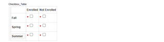
Check boxes can be used in forms as single yes/no fields or as part of a group of selectable options. When grouped, check boxes can be configured to control how many selections a user must make—such as requiring exactly one choice or allowing multiple selections. The sections below explain how to set up check box groups and how to use Minimum Length to manage required multi-select options.
Check Box Labels
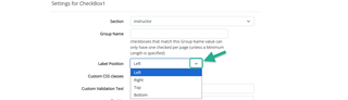
Check box labels can be positioned to the right, left, top, or bottom of the check box.
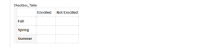
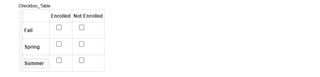
In grouped layouts (such as tables), designers often choose to hide the label for each individual check box to keep the formatting clean and consistent. For standalone check boxes, displaying the label is completely optional and depends on your preferred layout.
To change the label’s position:
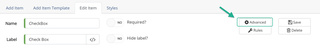
- Go to advanced in the Edit Item settings for that check box

