Best Practices
Requirements, Guidelines and Tips
A good form employs several factors including the length of the form, the time that it takes to complete, and the data that is being collected.
Requirements must be applied to your form to ensure compliance related to either ADA - American Disability Act/WCAG - Web Content Accessibility Guidelines or Yale University’s standards.
Guidelines are strongly suggested as they are best practices that either Yale Accessibility or User Experience Team has provided to ensure consistency and accessibility or recommendations for how to avoid common usability mistakes for forms built on this platform.
Usability Tips provide insight on how to make building forms easier or ensure efficiency both to the participants completing the form and admin who view and manage the form submissions.
Requirements
1. Form Item Name
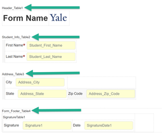
2. Build within Tables
3. Hyperlinks
4. Contact Information
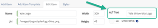
5. Image’s Alternate Text
6. Banner API/Events
1. Form Item Name
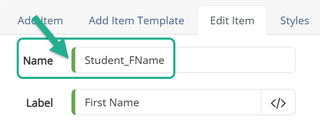
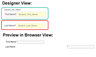
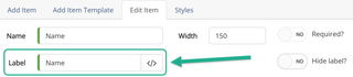
Form Item Name - All form items must have a unique ‘Name’ relative to their purpose or function, no spaces are allowed but underscores can be used.
- ADA Compliance: Form Item Names can be read by the screen reader, so to be compliant, always name Form Items appropriately.
Naming form items also makes it easier to reference fields within emails, rules and other areas. There should not be any form items with default names such as TextBox, TextArea, DatePicker, DropDownList, CheckBox, Image, FileUpload, RadioButton, etc.
Note: Name is the technical name tied to the form item, label is what is displayed on the form.
- Example - A valid form item name will display a green bar in front of the Name you typed, as seen circled in green below: