Form Items

Form Items

The following are the types of Form Items that can be included on a Dynamic Form and the settings that can be specified to suit your form needs. These can be found when editing a form under the “Add Item” tab, as seen circled in green below and dragged and dropped in the designing area, as seen circled in yellow below: 

Remember to Save

After creating or modifying any Form Items, remember to click Save to ensure your modifications are applied. Modifications will be lost if you do not Save. 

Form Items for Responses

Short Answer – Used to capture information less than 250 characters. See Advanced Settings below for further details on configuration options.

Long Answer – Used to capture information up to 10,000 characters.

Date Picker – Pop-up calendar control that makes it easy to select a date value.

(Drop Down) Choice List – Provides a drop-down list of response options to select from.

Advanced Settings - Manually add the response options Value and Description, then click the plus sign (+) to add to the drop-drop list. Value is the value tied to that option behind the scenes, Description is what is displayed to the participants in the drop-down list. 

Example - Value = CT; Description = Connecticut

Check Box – Provides a response value to check off. 

File Upload – Provides the ability to upload a file.

Radio Buttons – Provides response options to select from. 

Advanced Settings - Manually add the response options Value and Description, then click the plus sign (+) to add as a radio button option. Value is the value tied to that option behind the scenes, Description is what is displayed to the participants in the drop-down list. 

Example - Value = Y; Description = Yes

Signature Widget – Provides the ability to request a Signature or Initials anywhere within the form, which has an option for an automatically prefilled date timestamp at the time of signing.

NOTE: If you enabled Signatures at the Form level (in Name/Type menu) and dont use the Signature Widget, the default signature will appear on an additional last page of the form. Meaning after all Form Items are answered, the Form Participant will be asked to click Next to get to the final page where the default signature is requested. 

Existing Item - Basically Dynamic Forms version of copy and paste. Used to copy any type of Form Item that has already been configured from any form within the same Organization and paste to your form in the area you designate.  (so you don’t have to manually recreate and configure again)

Drag and drop Existing Item to the designated area, identify the Form Name and Field Name for the Form Item you want copied

Form Item Configurations 

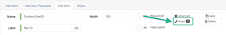
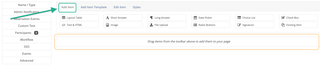
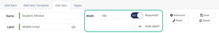
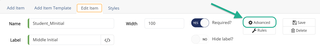
Configuration settings for each form item can be accessed by clicking the form item, which will bring you to the “Edit Item” tab, as seen circled in green below: 

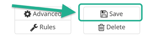
Note: Remember to click ‘Save’ after modifying settings, as seen circled in yellow below:

Required - Form Items can be marked as *Required if the applicant must give a response before submitting the form. Marking a form item as required will display a red asterisk * next to that form item to alert participants that its a required field. 

* = required field will be displayed in the upper right corner of all forms to notify particpants the mean of the red asterick, as seen below:

Hide Label – If only a response is necessary, and no label should be displayed on the form, hide label does just that and does not display a form item’s label on the form.

ADA Compliance: Even if you hide the label, be sure to add appropriate text to the label that describes the form item.

Width – The width of each response area/box can be configured.

Note: A normal PDF page is 1000 px (px = pixels) so the widest table on a form should be 900 px (less than 1000 px to account for margins). All other form items should be less than 900 px width.

Screenshot of Form Item Editor

Advanced Settings

Each form item’s advanced settings can be accessed by clicking on the form item which brings you to the Edit Item Tab, then clicking Advanced, as seen circled in green below:

Configure Advanced Settings:

Fields Type – Used to identify a specific formatted response/answer to be entered by form participant(s). Below are the options:

  • Generic Answer
  • Letters Only (A-Z)
  • Letters Only (A-Z) – spaces allowed
  • Numbers Only (0-9)
  • Numbers with 2 Decimals
  • Date MM/DD/YYYY
  • Phone Number (###)###-####
  • SSN ###-##-####
  • Email Address
  • Dollars & Cents $###,###.##
  • Dollars & Cents (Long) $###,###,###.##
  • Dollars (no Cents) $###,###
  • Prefill – based on User Profile or API

Mask input? - Will not display what the participant is inputting into the field but will display the data entered when Admin view the form submission. 

Example: When entering a Social Security Number the input will be displayed to participant as dots instead of actual numbers, as seen below:

Minimum Length – Used to require at least a minimum response to be entered by participant.

Maximum Length – Used to identify the maximum response to be entered by participant.

Calculated Field – Used to do calculations within a form based on data entered by participant.

Label Position – Used to identify the location of the Label in relation to the Response box; ie. Left, Right, Top, Bottom.

Rules

Applying rules and conditions to your form allows it to become interactive, as it can ‘show’ or ‘hide’ form items based on certain conditions or responses given by the participant. 

To learn more about configuring rules, go to Designer Resources > Form Items > Rules

Other Form Items

Table – All form items must be within a Table to control layout and automatically control spacing between form items, no matter what size screen the participant is viewing the form on. 

NOTE: Form items not included within Tables will not be automatically spaced, ie. will display the label to the far left and the response box to the far right of the screen the participant is viewing on.

ADA Compliance: Appropriately name tables based on their general purpose, as the screen reader may read the table name. 

Text & HTML – Ability to display formatted text that does not require a response. Click the “</>” box to the right of Text box to format your text, which will open a Widget Window for further configuration. 

Image – Ability to display an image.

ADA Compliance: Alternate text must be included that describes the image, as a screen reader will read this alternate text.

Widget Window Configuration

Source – Allows you to access and modify the HTML behind the text. You must remember to unclick Source after making any HTML modifications in order for the changes to be applied. 

NOTE: This is useful when trying to adjust the color to the specific Yale Blue. 

Yale Blue = #00356b
Secondary Yale Blue = #286dc0
Light Yale Blue = #63aaff

Save - Do not use this Save option. To properly save, use the Save Button on the bottom right of the window. We do not suggest using this button.

New Page - We do not suggest using this button. To properly create a new page in your form, please click the ‘+’ (plus) icon to the right of “Pages” located in the left side menu in the Designer View. Clicking this ‘New Page’ button will only reset and erase the current form item settings that you are currently configuring. 

Preview - We do not suggest using this button. Displayed the formatted text in a new browser window.

Print – We do not suggest using this button. Prints the Designer view of the form, including all designer menus, features and layout. To print the actual form as displayed to a participant, use the ‘Preview in Browser’ or ‘Preview as PDF’ features found on the left side under Pages.

Templates – We do not suggest using this button. Displays various pre-made format templates.

Cut – Cuts selected text. We suggest using other methods for cutting.

Copy – Copies selected text. We suggest using other methods for copying.

Paste – Pastes text. We suggest using other methods for pasting.

Paste as plain text – Pastes text, stripping it of any formatting. We suggest using other methods for pasting.

Paste from Word – Pastes text from a Word document. We suggest using other methods for pasting.

Undo – Undoes most recent changes in the text editor. We suggest using other methods for undoing.

Redo – Redoes previously undone changes in the text editor. We suggest using other methods for redoing.

Find – Searches for specific terms or phrases in the text editor. 

Replace – Finds specific terms or phrases and changes all of them at once.

Select All – Selects everything in the text editor.

Link – Adds hyperlinks to text.

ADA Compliance: Always underline the hyperlink to be ADA compliant. By default, the hyperlink is underlined when a participant hovers over the text, but we must make it permanently underlined to be ADA compliant.

ADA Compliance: If referencing a website, be sure to go to Target tab and set it to open a ‘New Window (_blank)’ so when participant clicks the hyperlink it will open that website in a new window, opposed to re-directing their current window which contains the form. This will allow the participant to easily go back to their original window that contains the form so they can continue filling out the form.

Unlink – Removes links from text. Remember to remove the underline from text.

Image – Inserts an image by referencing a URL. We suggest adding an image by using the ‘Add Item > Image’ feature, opposed to adding an image by referencing the URL. Please contact DynamicForms.ITS@yale.edu if you need instructions on how to add an image by referencing a URL.

Flash – Uploads a video from a URL. 

Table – Inserts a table with the ability to configure the table settings such as borders, width, height, headers, spacing, padding, alignment, etc. 

Insert Horizontal Line – Inserts a horizontal line that goes the width of that form item.

Smiley – Allows users to select from a set of smileys or emojis and insert into form item.

Insert Special Character – Allows users to select a variety of special characters. 

Insert Page Break for Printing – Inserts a page break that will appear when the form is printed.

iFrame - Allows iFrame properties to be configured. We do not suggest using this feature.

Insert/Remove Numbered List – Formats as a numbered list or removes the numbered list. 

Insert/Remove Bulleted List – Formats text as a bulleted list or removes the bulleted list.

Bold – Bolds text.

Italic – Italicizes text.

Underline – Underlines text.

Subscript – Formats text as a subscript (displays the text below the line).

Superscript – Formats text as a superscript (displays the text above the line).

Copy Formatting – Copies text with formatting.

Text Color – Changes the color of the text.

Background Color – Changes the background color of the text.

Decrease Indent – Decreases indentation.

Increase Indent – Increases indentation.

Block Quote – Formats text as a block quote.

Create Div Container - Create and set Div Container properties.

Align Left – Aligns text left within the form item width.

Center – Centers text within the form item width.

Align Right – Aligns text right within the form item width.

Justify – Justifies text within the form item width.

Text direction from left to right – Text is read from left to right.

Text direction from right to left – Text is read from right to left. We don’t suggest using this feature.

Set language – Changes the language. This feature does not seem to be applied correctly, so we suggest not using it. However, we have inquired with NextGen to find out if this feature will be fixed so we can leverage.

Formatting Styles – Allows users to choose from a variety of text styles and formats.

Paragraph Format – Allows users to create and format several levels of headings.

Font Name – Changes the font of the text.

Font Size – Changes the size of the text.

Reminder to Save

After creating or modifying any Form Items, remember to click Save to ensure your modifications are applied. Modifications will be lost if you do not Save. 

Questions? Contact Dynamic Forms ITS Team by emailing DynamicForms.ITS@yale.edu